Upgrade & Secure Your Future with DevOps, SRE, DevSecOps, MLOps!
We spend hours on Instagram and YouTube and waste money on coffee and fast food, but won’t spend 30 minutes a day learning skills to boost our careers.
Master in DevOps, SRE, DevSecOps & MLOps!
Learn from Guru Rajesh Kumar and double your salary in just one year.
Apps often require users to enter information into a text field. For example, you might require users to log in with an email address and password combination.
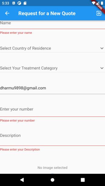
To make apps secure and easy to use, check whether the information the user has provided is valid. If the user has correctly filled out the form, process the information. If the user submits incorrect information, display a friendly error message letting them know what went wrong.
In this example, learn how to add validation to a form that has a single text field using the following steps:
- Create a
Formwith aGlobalKey. - Add a
TextFormFieldwith validation logic. - Create a button to validate and submit the form.
1. Create a Form with a GlobalKey
First, create a Form. The Form widget acts as a container for grouping and validating multiple form fields.
When creating the form, provide a GlobalKey. This uniquely identifies the Form, and allows validation of the form in a later step.
import 'package:flutter/material.dart';

// Define a custom Form widget.
class MyCustomForm extends StatefulWidget {
  const MyCustomForm({super.key});

  @override
  MyCustomFormState createState() {
    return MyCustomFormState();
  }
}

// Define a corresponding State class.
// This class holds data related to the form.
class MyCustomFormState extends State<MyCustomForm> {
  // Create a global key that uniquely identifies the Form widget
  // and allows validation of the form.
  //
  // Note: This is a `GlobalKey<FormState>`,
  // not a GlobalKey<MyCustomFormState>.
  final _formKey = GlobalKey<FormState>();

  @override
  Widget build(BuildContext context) {
    // Build a Form widget using the _formKey created above.
    return Form(
      key: _formKey,
      child: Column(
        children: <Widget>[
          // Add TextFormFields and ElevatedButton here.
        ],
      ),
    );
  }
}
2. Add a TextFormField with validation logic
Although the Form is in place, it doesn’t have a way for users to enter text. That’s the job of a TextFormField. The TextFormField widget renders a material design text field and can display validation errors when they occur.
Validate the input by providing a validator() function to the TextFormField. If the user’s input isn’t valid, the validator function returns a String containing an error message. If there are no errors, the validator must return null.
For this example, create a validator that ensures the TextFormField isn’t empty. If it is empty, return a friendly error message.
TextFormField(
  // The validator receives the text that the user has entered.
  validator: (value) {
    if (value == null || value.isEmpty) {
      return 'Please enter some text';
    }
    return null;
  },
),
3. Create a button to validate and submit the form
Now that you have a form with a text field, provide a button that the user can tap to submit the information.
When the user attempts to submit the form, check if the form is valid. If it is, display a success message. If it isn’t (the text field has no content) display the error message.
ElevatedButton(
  onPressed: () {
    // Validate returns true if the form is valid, or false otherwise.
    if (_formKey.currentState!.validate()) {
      // If the form is valid, display a snackbar. In the real world,
      // you'd often call a server or save the information in a database.
      ScaffoldMessenger.of(context).showSnackBar(
        const SnackBar(content: Text('Processing Data')),
      );
    }
  },
  child: const Text('Submit'),
),